Making FUTURE FUR
Author
Tim Meyer
FUTURE FUR didn’t emerge from a single lightbulb moment. It was a gradual and thoughtful process that unfolded over months of collaboration. The journey encompassed numerous discussions, experimentation with various packaging options, in-depth exploration of the brand story, and working closely with the founders to shape the identity from every angle.
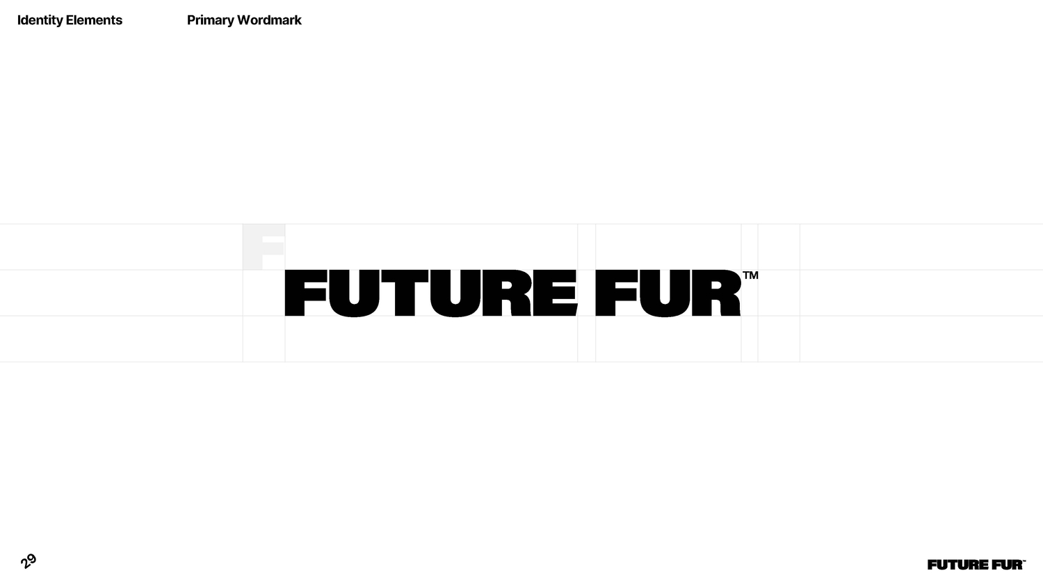
The brief was simple. “Not like the others. Make it playful.” This immediately opened up the possibility of creating something interesting. What emerged is a homewares brand with a distinct point of view. Everything from the bold colours, the direct simplicity and honesty of the type.
Atollon designer Sam Koesterke played a central role in shaping the Future Fur world. From early experimentation with product labels and visual identity, the direction was bright, warm, playful and honest. It had to be ready for dogs, kids, busy days, late nights and the occasional accidental wine spill. Representative of a product with purpose, but also a sense of fun.
We wanted the brand to feel like something you’ve seen before, but never quite like this. Familiar enough to trust, bold enough to stop you, and simple enough to live with every day.
It became one of those rare projects where every decision supports the next; the voice, the colour, the angle, the photography. Some of the most satisfying details are the ones people don’t consciously notice, like the corner tilt of the labels and the balance of the colour, all small touches designed with intention. We wanted the brand to feel like something you’ve seen before, but never quite like this. Familiar enough to trust, bold enough to stop you, and simple enough to live with every day. Slightly rebellious but still tasteful enough to sit in design-conscious lifestyles.
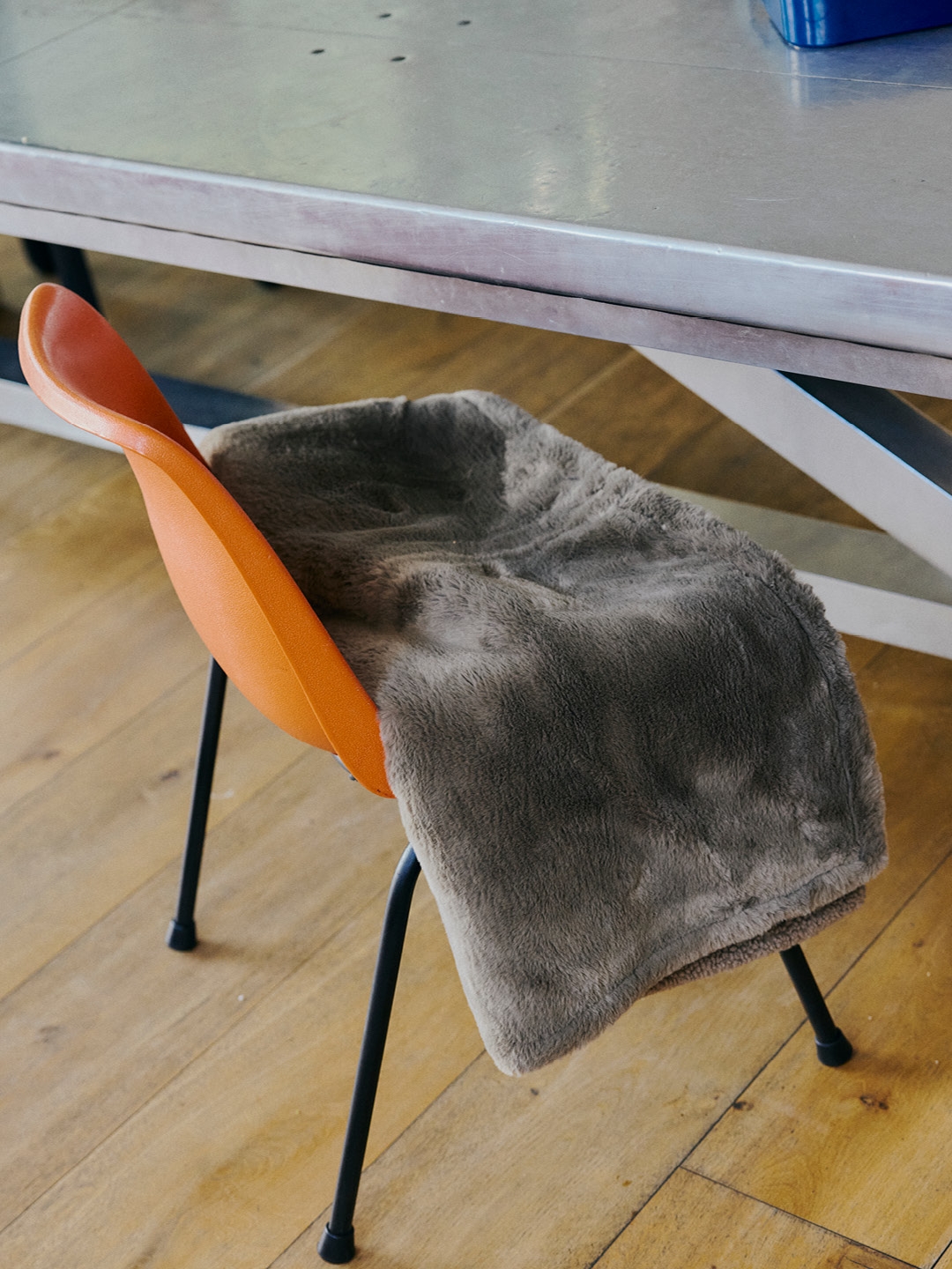
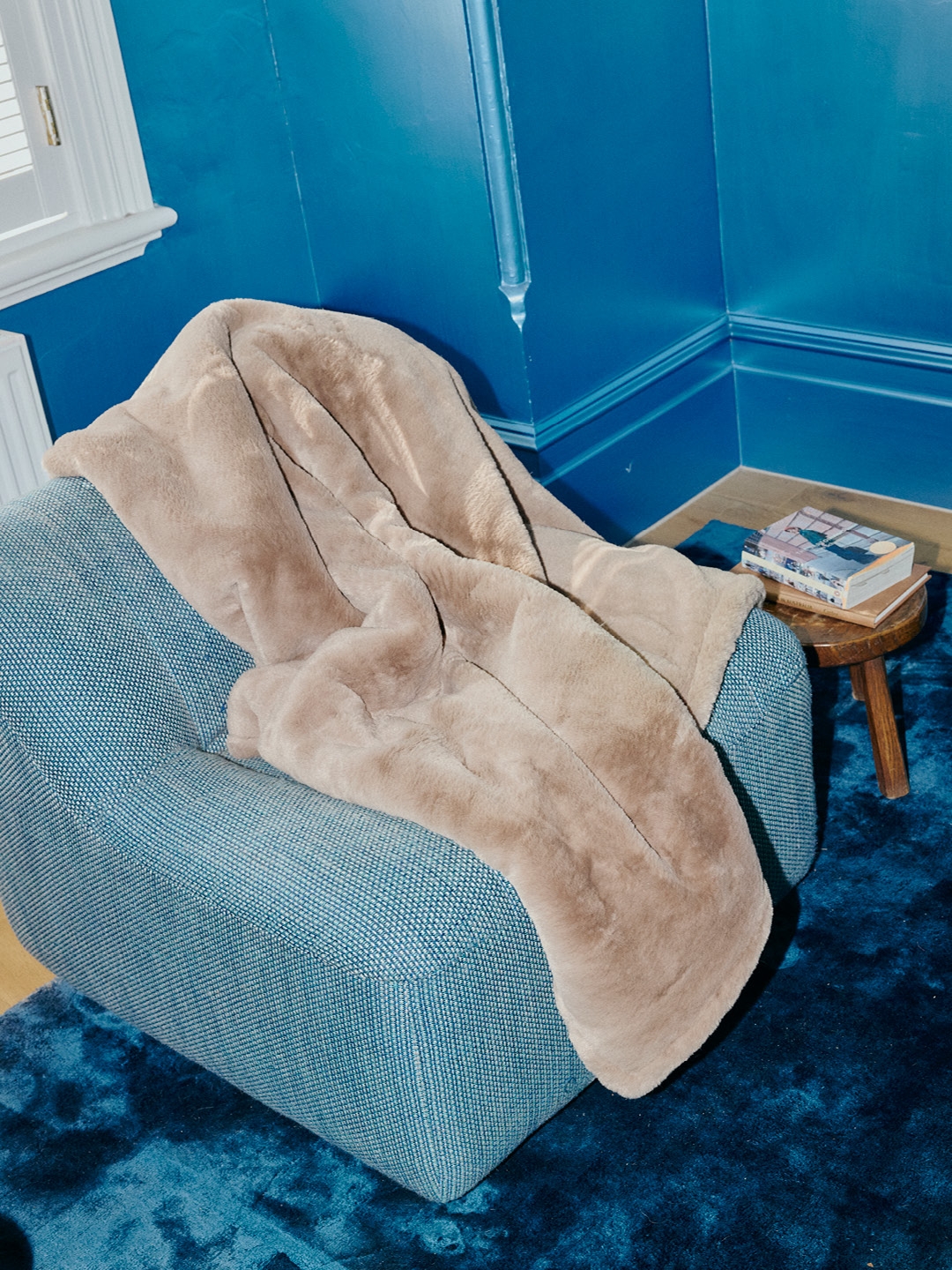
The fun of FUTURE FUR was in finding the balance point between chaos and calm. The blanket is built for antics, but it’s also a beautiful object. The identity had to sit in that tension and enjoy it.
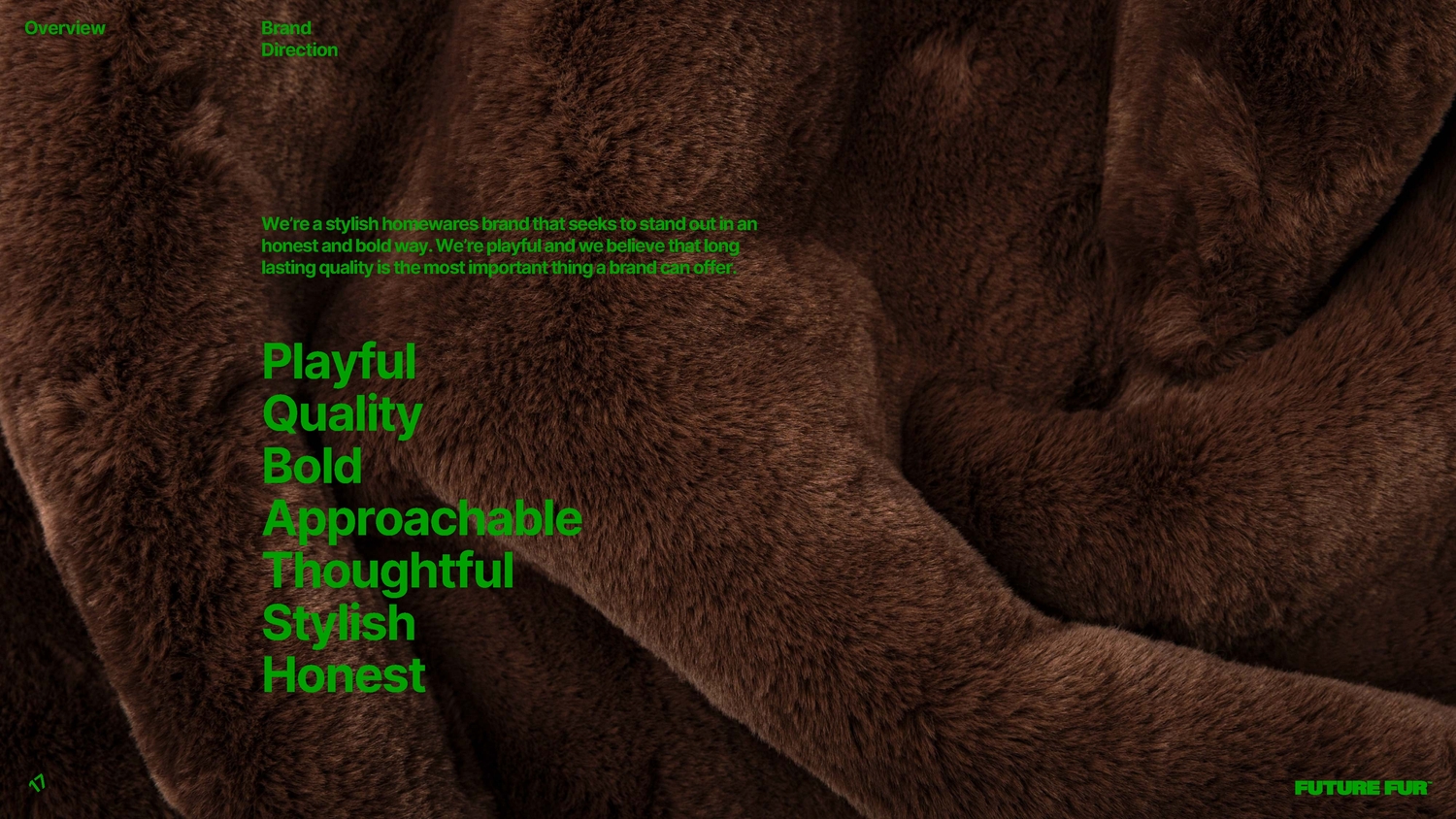
The tone of voice arrived before the identity, shaping every design decision. The brand speaks like a friend, honest, warm and clever, without showing off. Straightforward without being blunt and light-hearted without being silly. A tone that respects the customer’s intelligence and keeps things simple. This clarity unlocked the entire visual system. If the brand speaks plainly, the design follows. If the voice is warm, the typography stays friendly. If the humour is subtle, the layout gives it space. Honesty became the backbone.
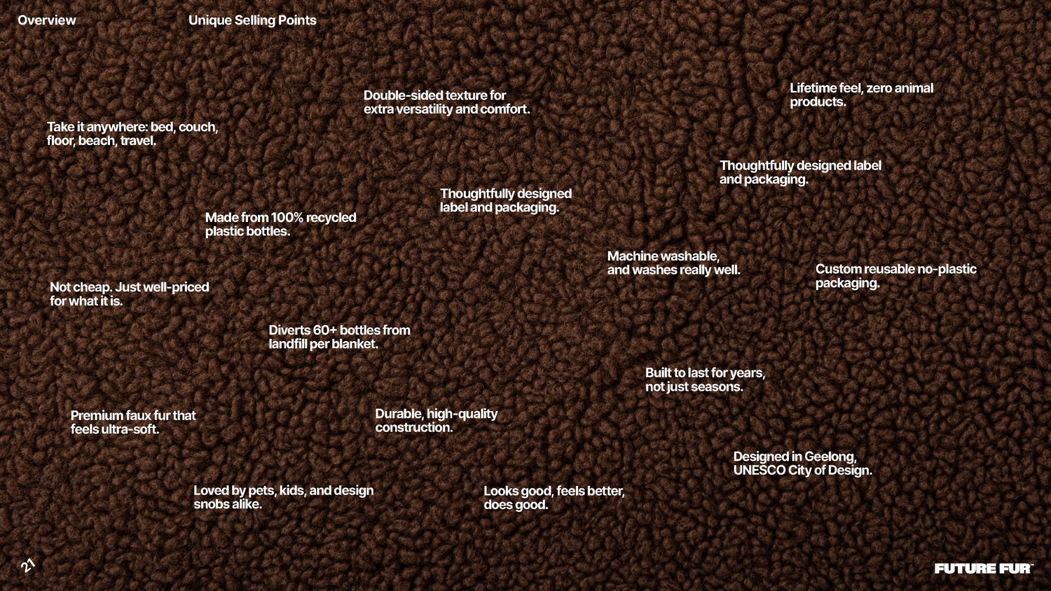
The founders brought decades of experience in fashion and textiles, along with a clear sustainability perspective. For years, eco products were boxed into a relatively narrow aesthetic. Today, that world has shifted, and sustainability is integrated rather than announced. The founders cared deeply about sustainable manufacturing, but we saw it as the baseline rather than the story. A tone that avoids the preachiness that can often come from eco-led narratives. Sustainability is a happy by-product, not the core headline, stylish without greenwashing, and the communication follows that mentality.
Early R&D kept circling back to the playful energy of the 1960s and 1970s. A time full of colour, curiosity and possibility, piloted by Industrial design house Kartell and Corporate furniture manufacturer Sebel. Utilising primary coloured plastics and Industrial charm wrapped in simple shapes. A warm idea of the future that still feels contemporary.
This blend connected naturally with the clean lines and clever simplicity of mid-century Australian modernism. Houses by Harry Seidler or Nino Sydney, filled with light and honest materials. A FUTURE FUR throw belongs in that world, and the identity leaned into that feeling. It guided colour, structure, space and the overall tone.
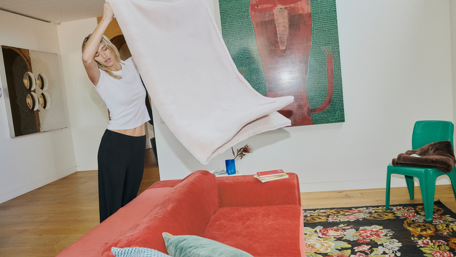
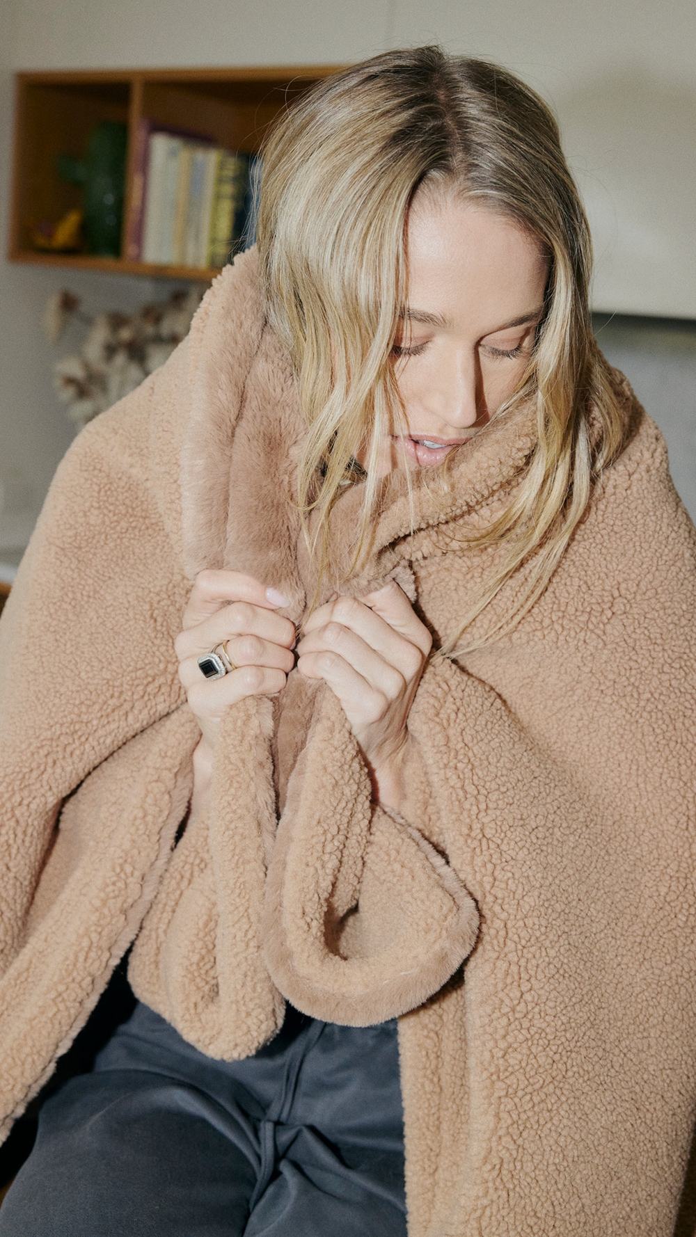
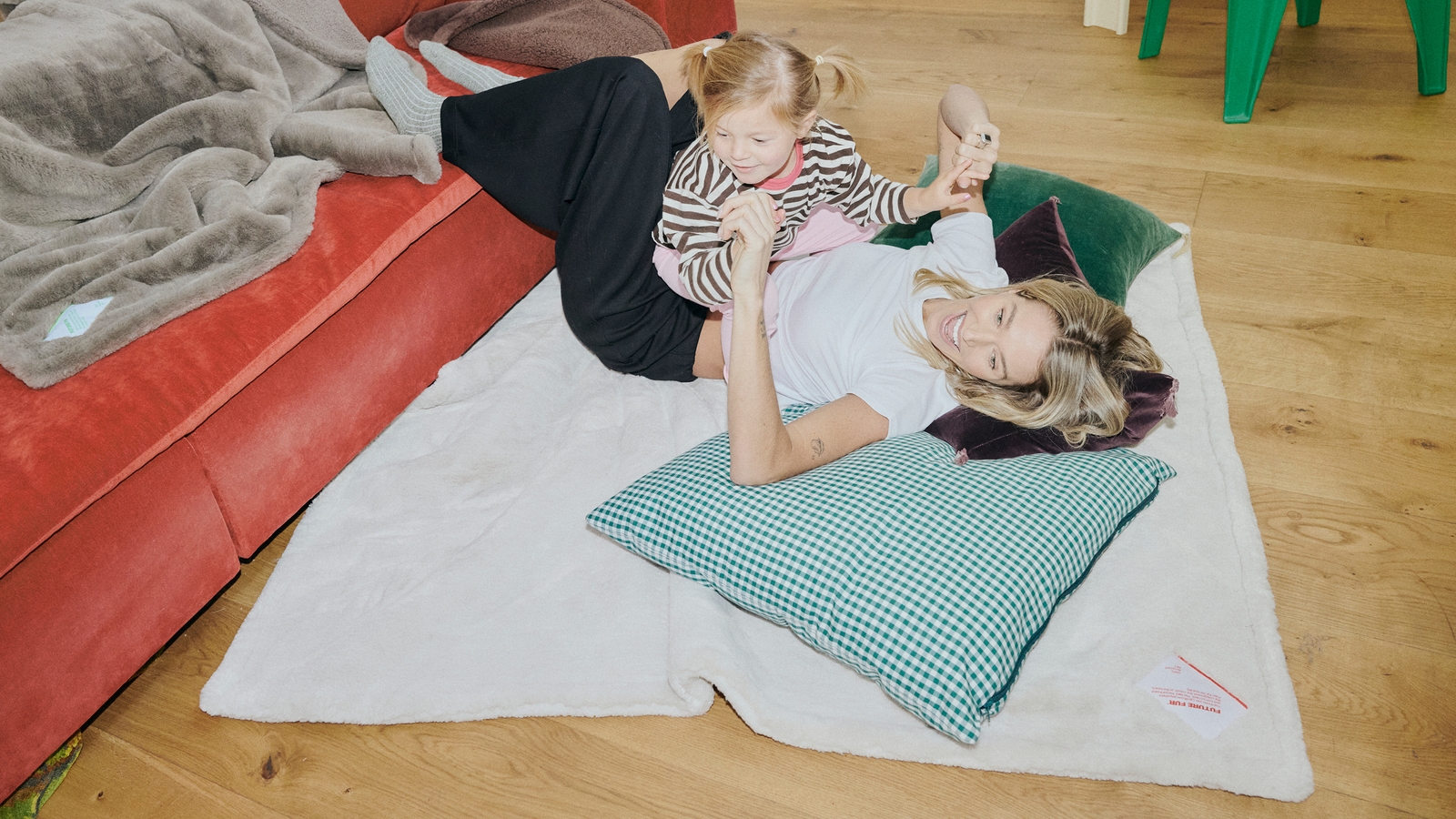
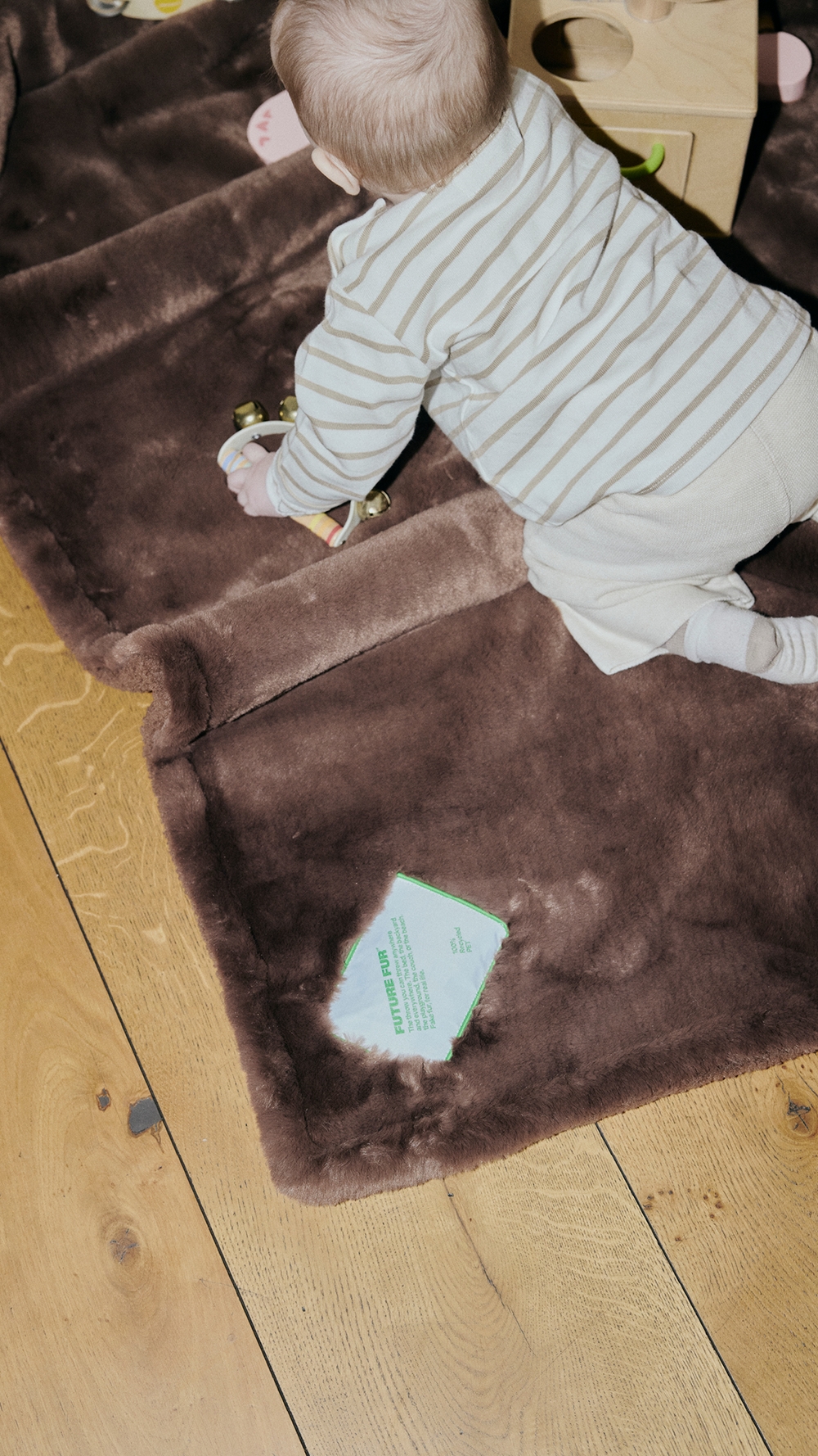
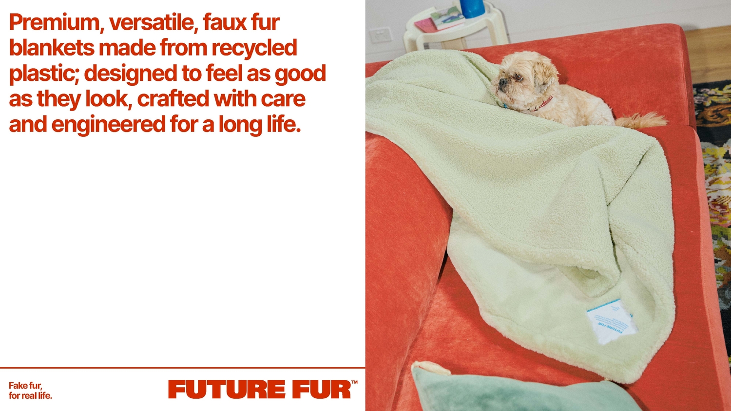
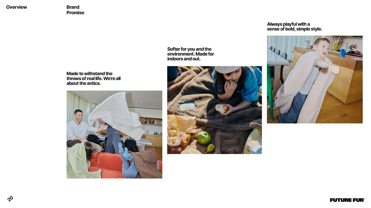
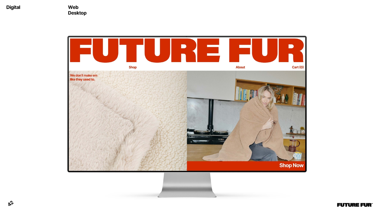
One of the most critical challenges was balancing premium design and everyday usability. Photography became central to resolving that tension; we wanted scenes that feel lived in. Capturing real moments in natural light, think Instax-style shots and family SLR memories. The imagery direction needed to help the product stand out in its own category. Blurring the lines between homewares, fashion and outdoor gear, as well as being a child and pet-friendly essential.
Dylan captured a balance between quiet, homely moments and the candid antics of family chaos. We shot the textures and product details in-house to maintain consistency without losing Dylan’s personality.
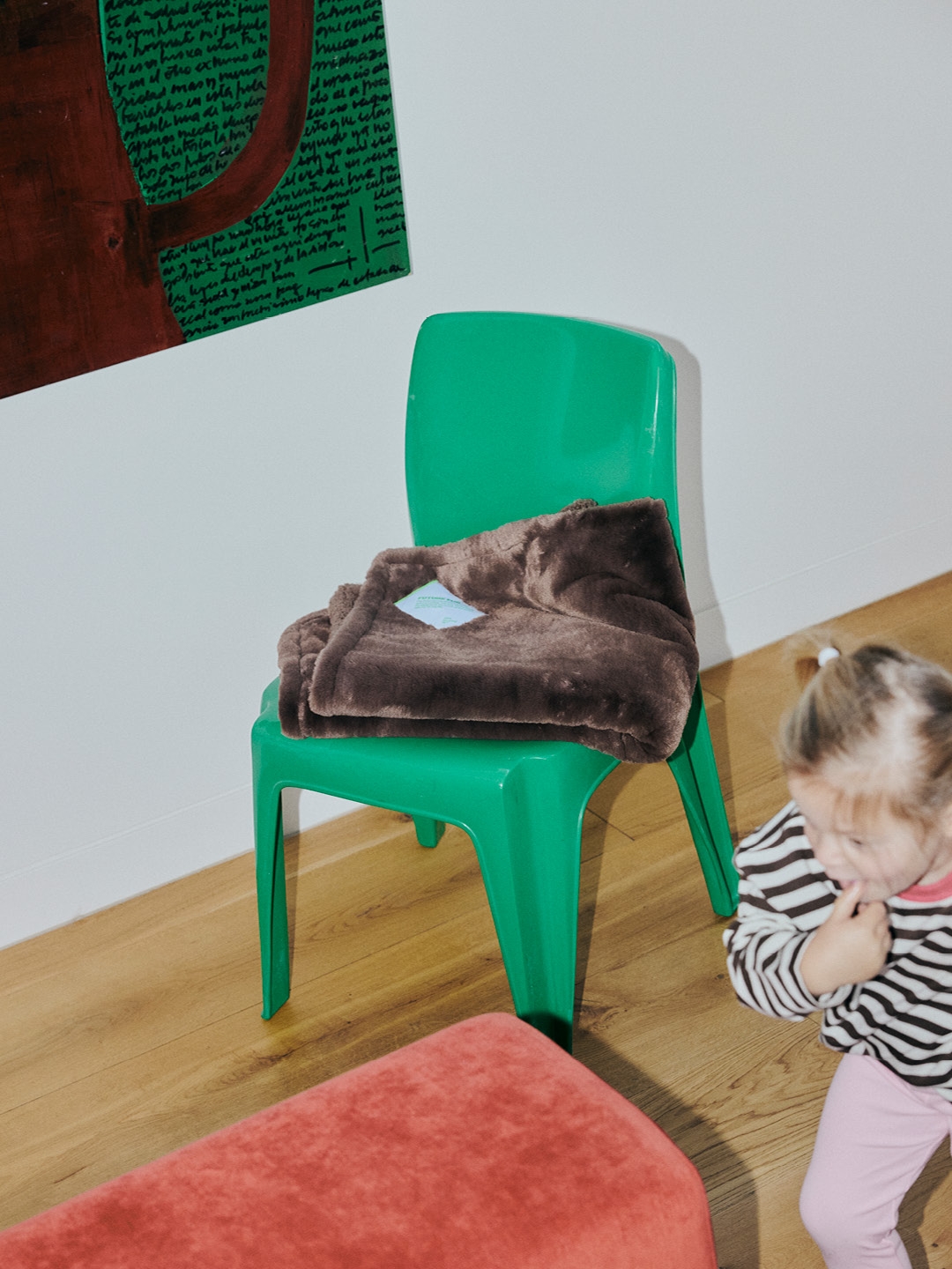
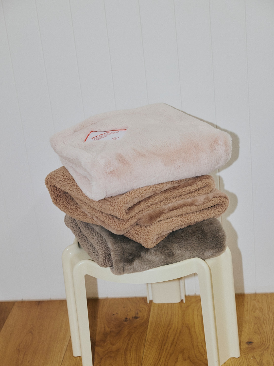
Photography became our bridge between premium and playful. Candid flash moments, warm interiors, messy dogs and quiet nooks all living in one world. That mix is what makes FUTURE FUR feel alive.
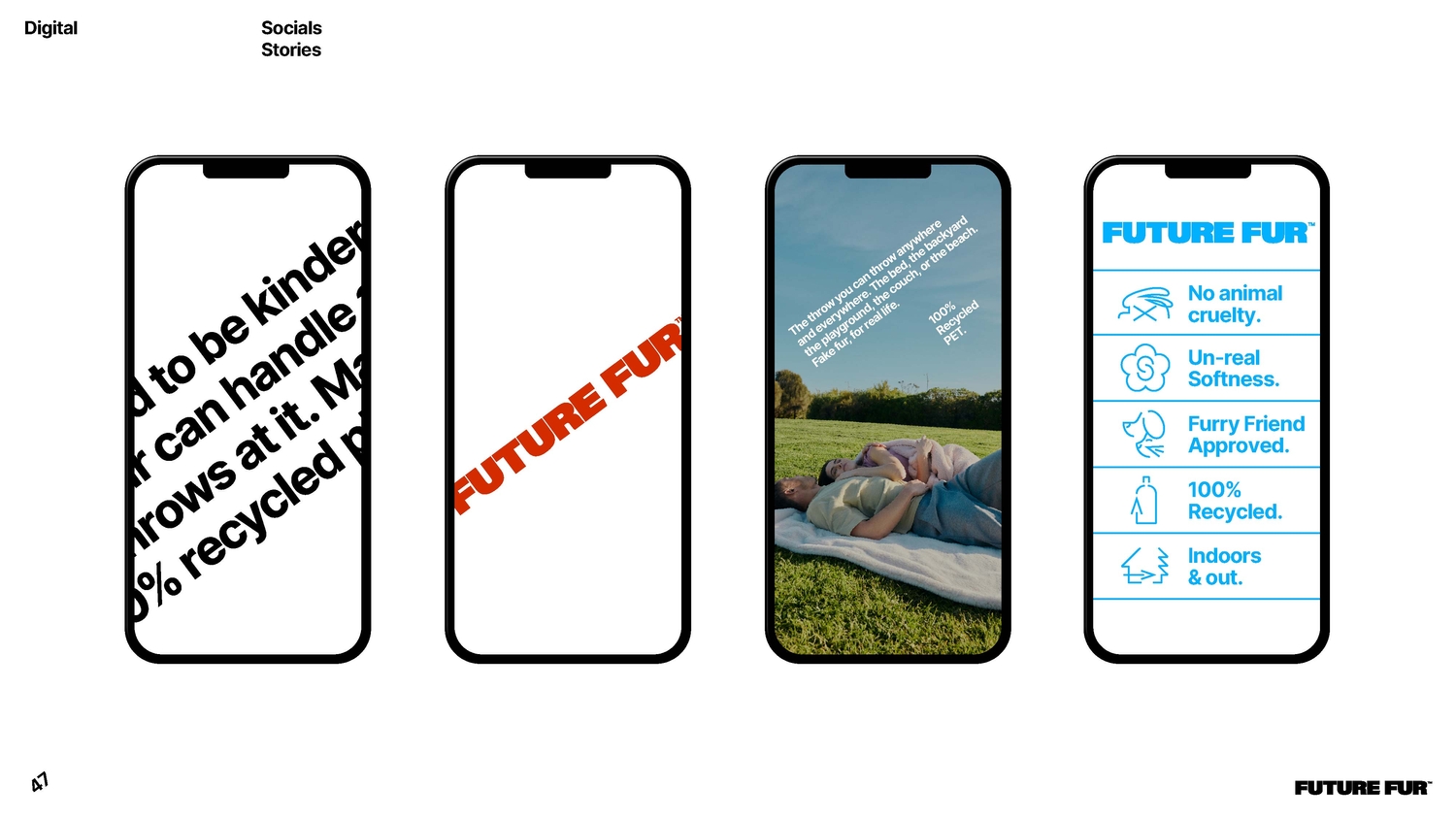
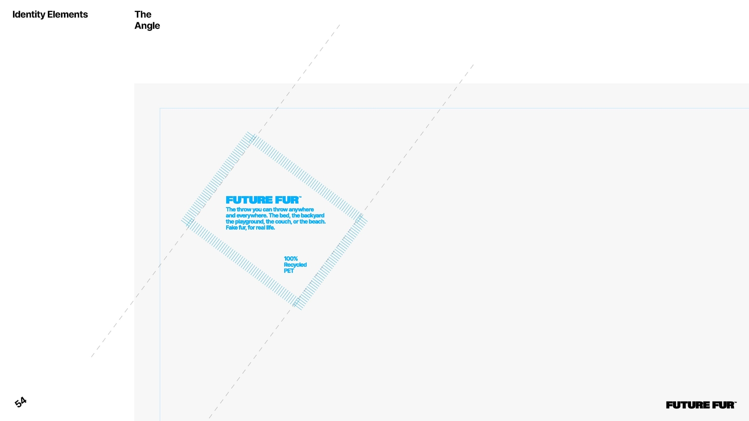
Every identity should have a quiet detail that becomes its anchor. For FUTURE FUR, it was the 36.75 degree angle. Pulled directly from the product labels, which were tilted initially to sit neatly in the corner of the blanket. That tiny decision carried more personality than expected. It felt like the right amount of playful, simple, and perfectly off-centre. Once it appeared in the product, we could see how naturally it could fit into layouts, lockups, and everything else. A subtle bit of motion that never overwhelms. One precise slant that became an instantly recognisable part of the system.
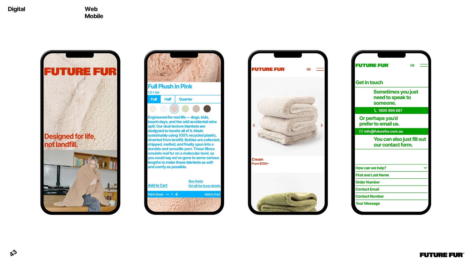
“Do not blend in. Make it playful.” There was no interest in the expected eco aesthetic. FUTURE FUR deserved something fresher and more culturally fluent. The blankets themselves are tonal and warm. The brand around them is bright and graphic. That contrast creates an interesting tension. Playful, but not childish. Bold, but still refined. A colour palette with attitude. Bright red, fresh green and a clean, punchy blue. It nods to the references while still feeling unique in the homeware space.
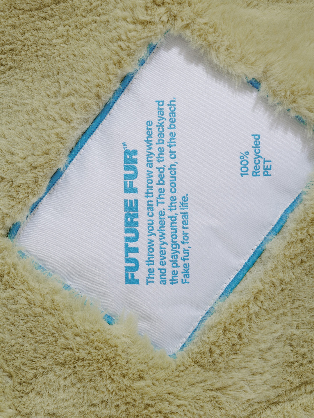
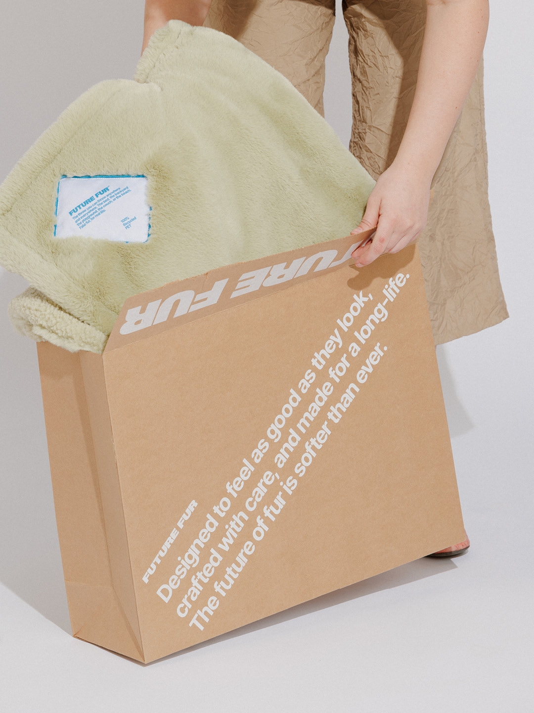
The founders trusted us to push the identity far beyond the usual homewares playbook. That trust is the reason this brand feels so confident. Every decision was made with clarity, not compromise. The goal was to build a future that feels warm, not sterile. A future with colour, personality and a wink. Something optimistic enough to be playful, and grounded enough to last.
Stock music is virtually useless if you really want something on brand; the FUTURE FUR feeling we were after was just too specific. A search for “Retro Future Optimism” didn’t yield much, and we needed the sound to feel as good as the product does. So to complete the world, we called in Atollon digital designer (who happens to also be an amazing, accomplished music producer) Rohan Newman (DJ, Roland Tings) to create the sonic brand layer from scratch. Music that captured warmth, softness and nostalgia, but at the same time had an edge to it that would allude to the “futuristic” element of the brand. A perfect match for the videography. A real highlight of the process, the sound added a living, breathing energy to the brand and beautifully tied all the content together. Another aspect where the founders made the right move.
Thank you, Ellidy Pullin, Danielle Pelly and Tim Wilkins, for placing complete trust in the studio.
0

