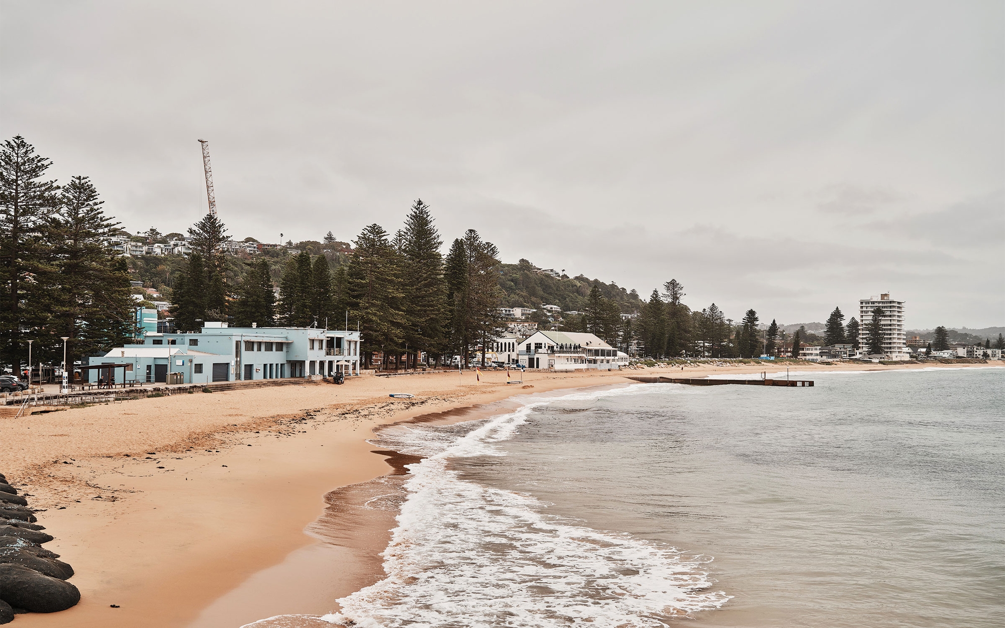
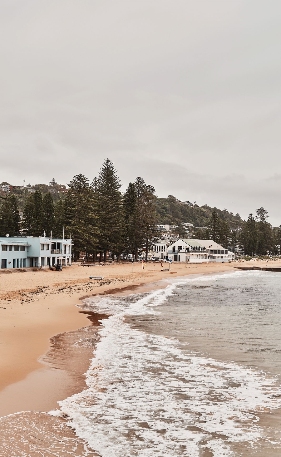
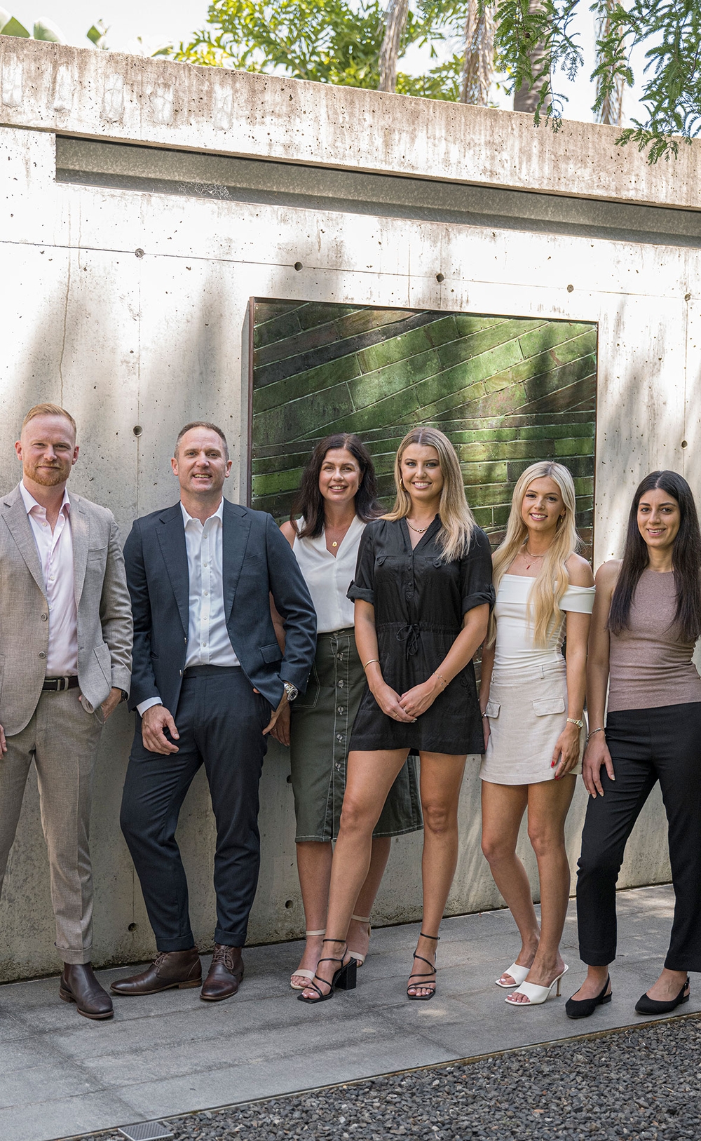
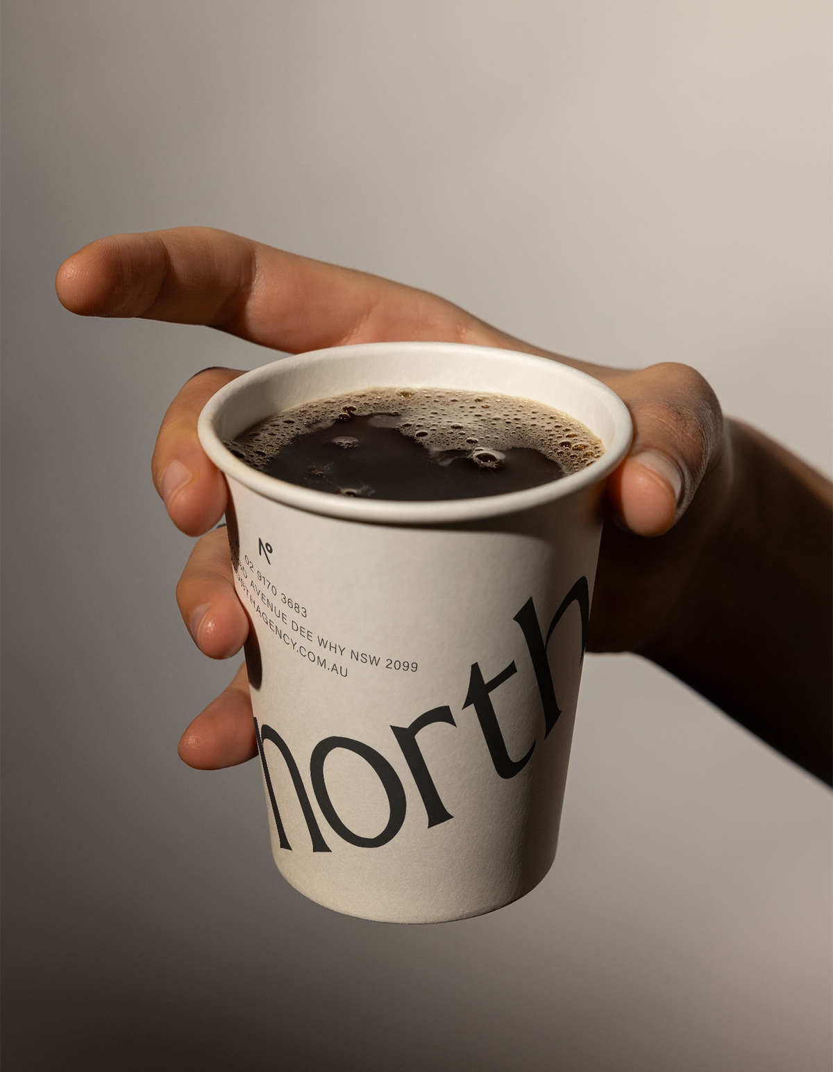
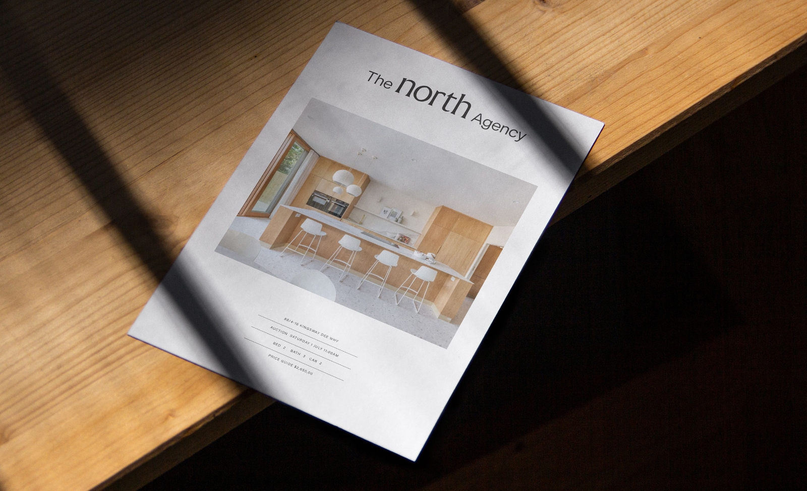
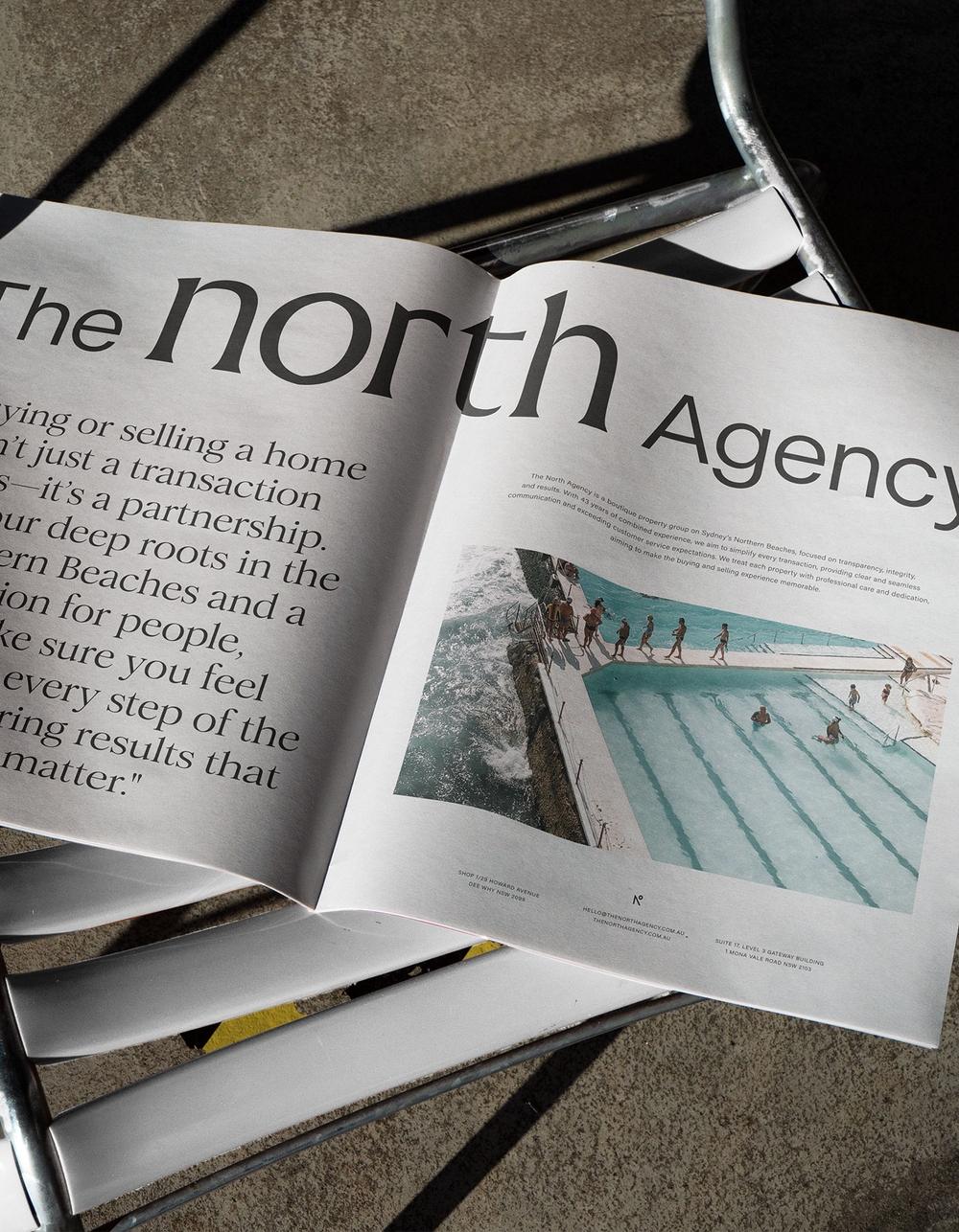
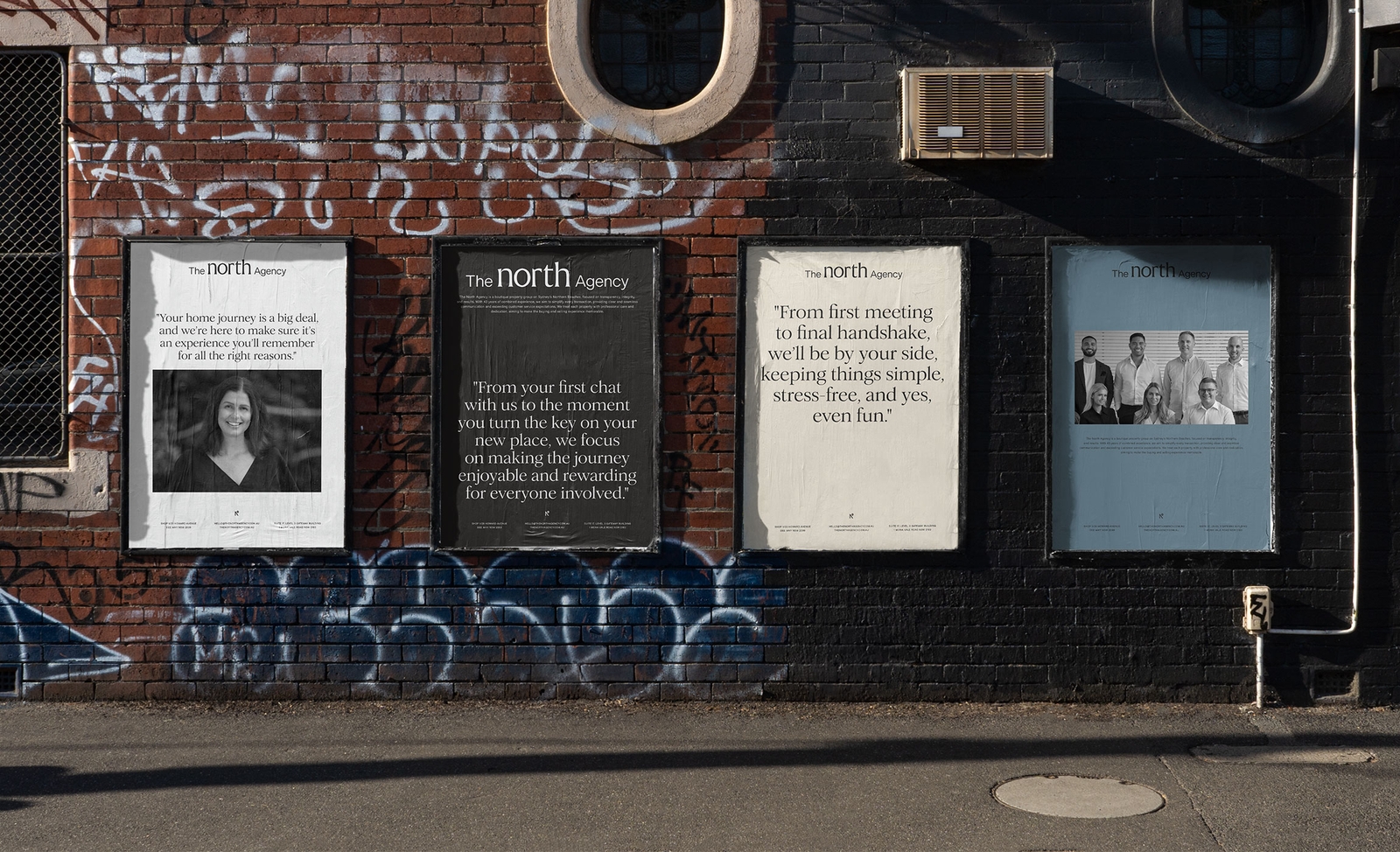
The North Agency’s new identity is all about standing out by staying true to who they are. It’s conversational, bold, and built to connect with people on a personal level—creating a brand that feels as genuine and approachable as the agents themselves.
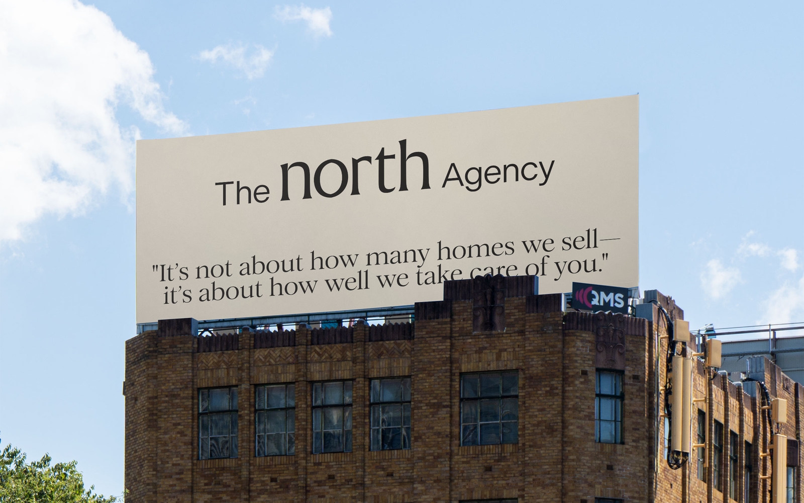
From the first meeting to the final handshake.
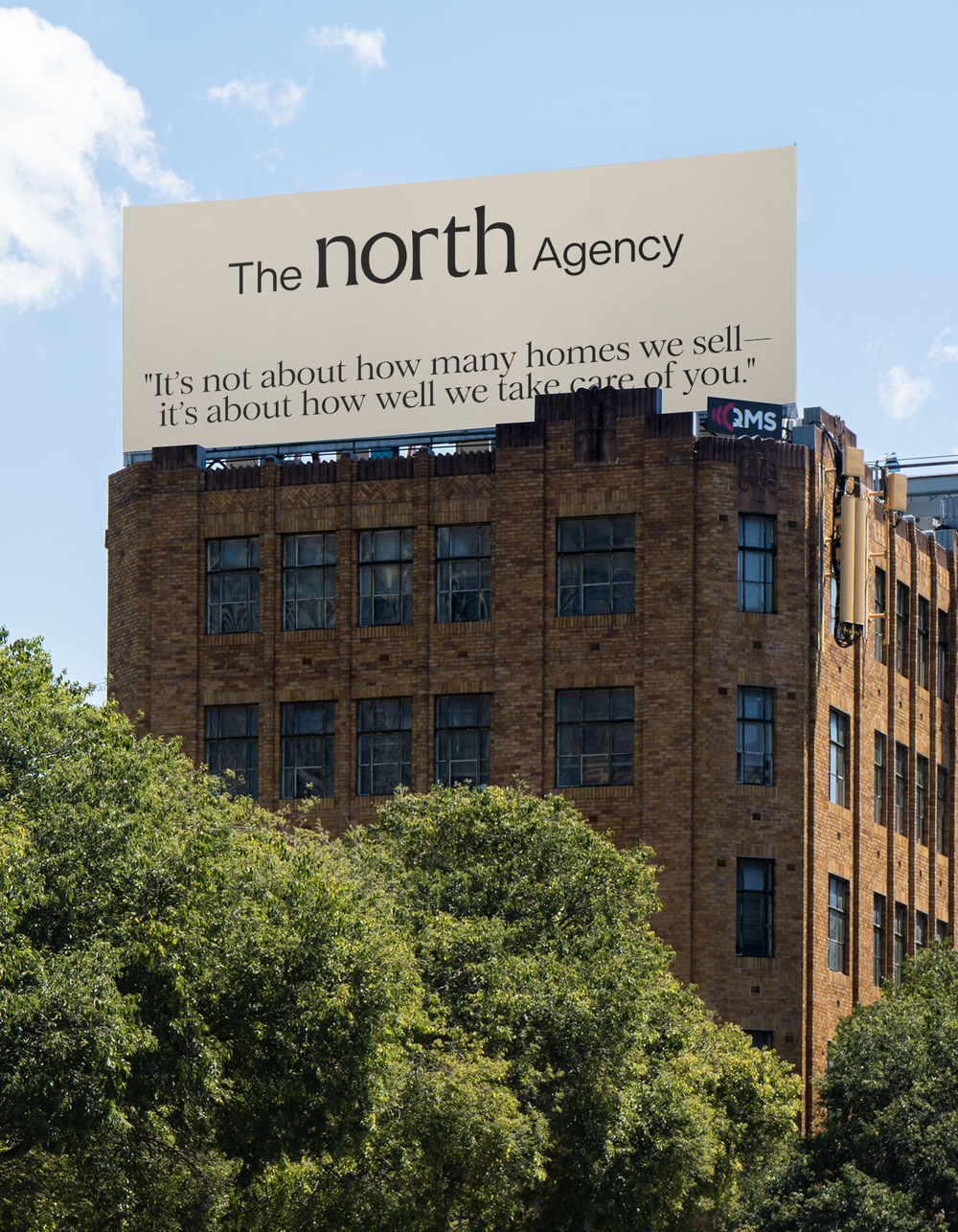
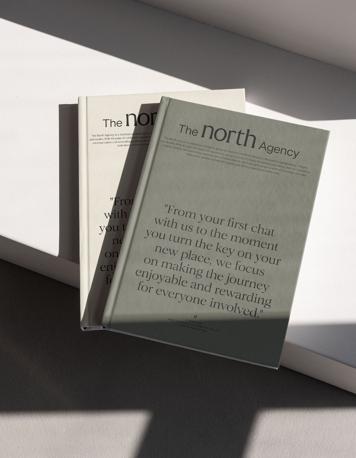
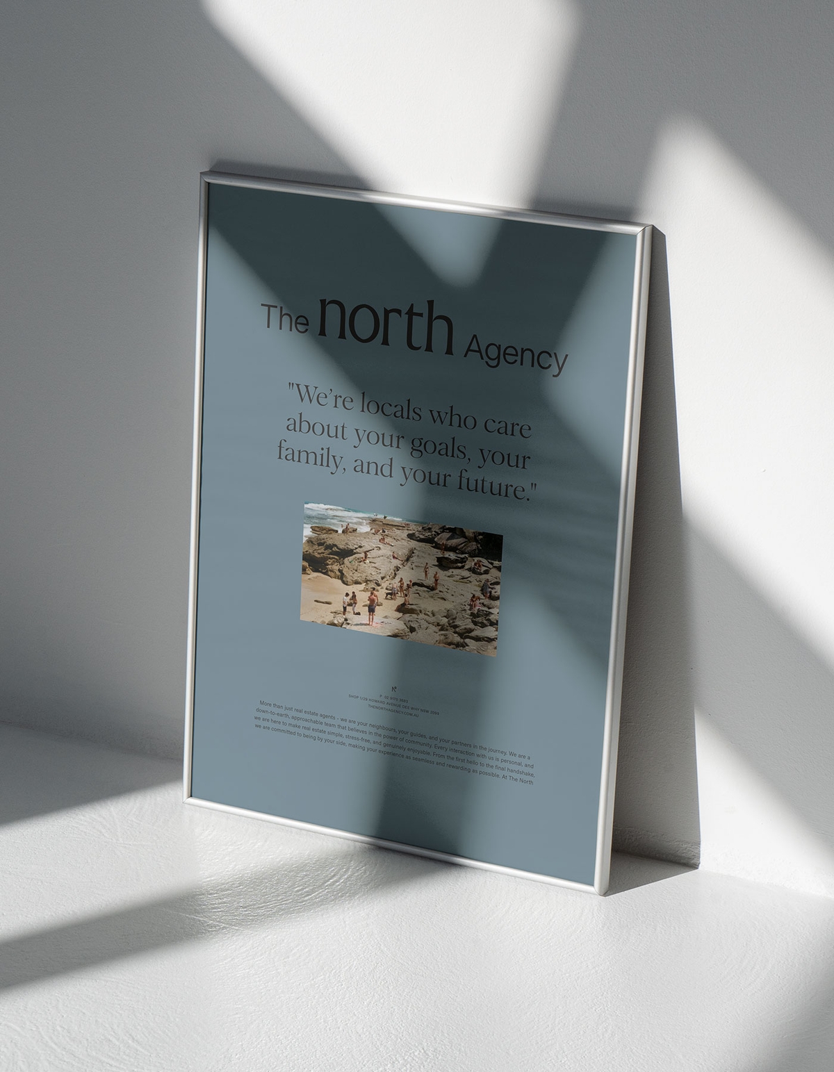
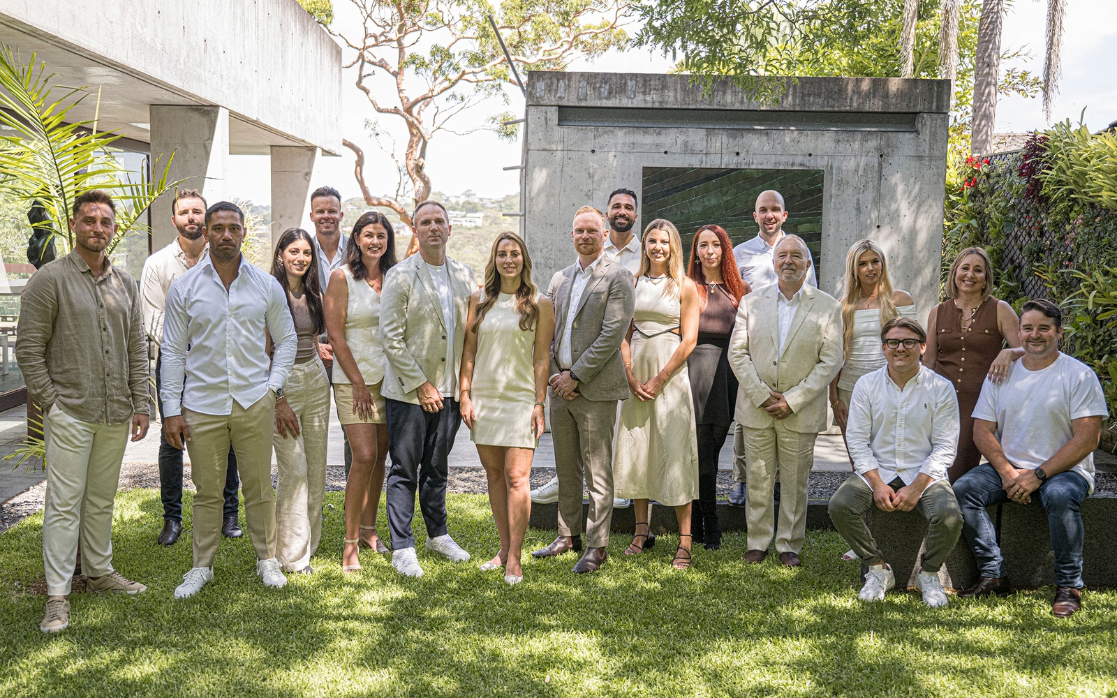
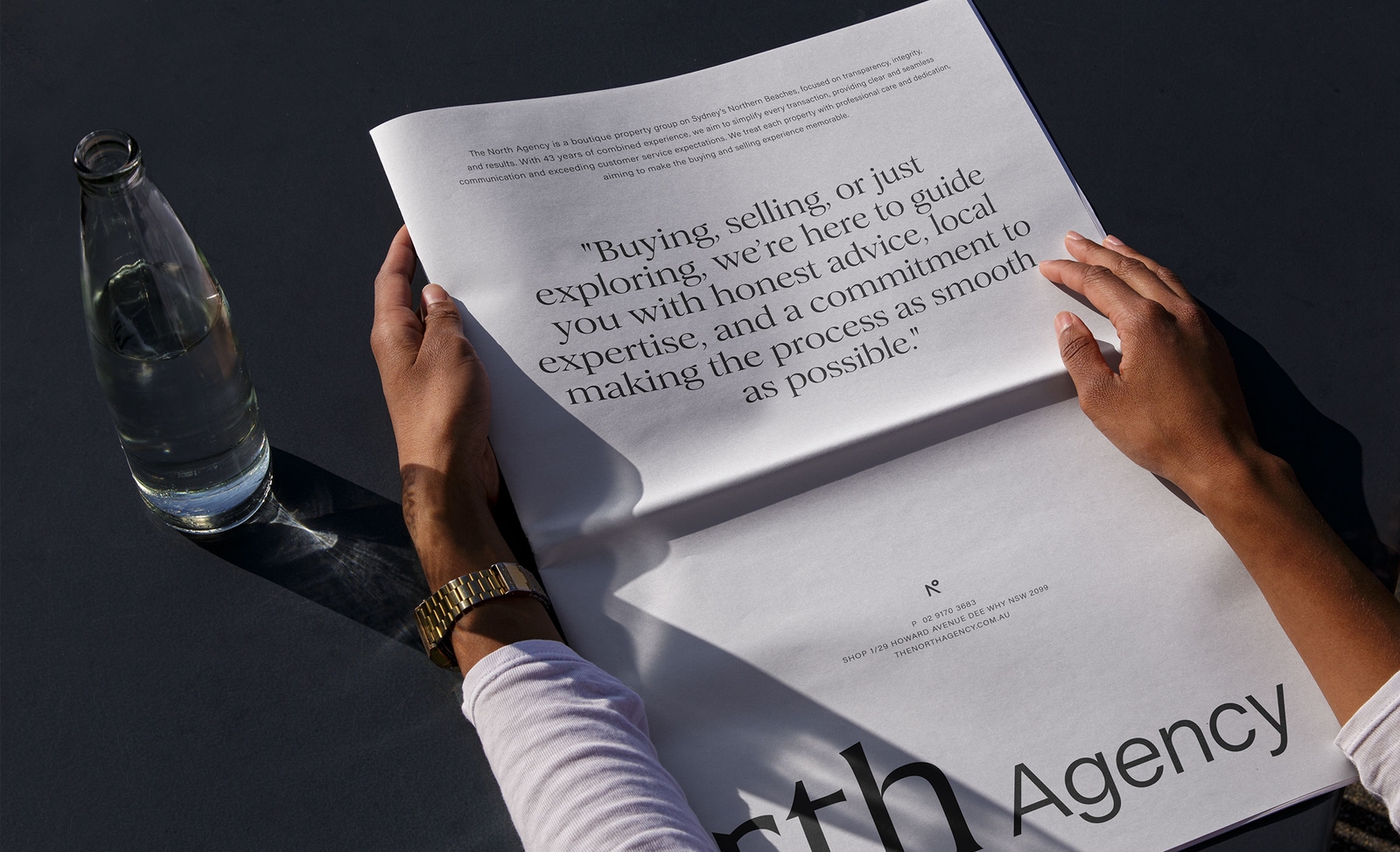
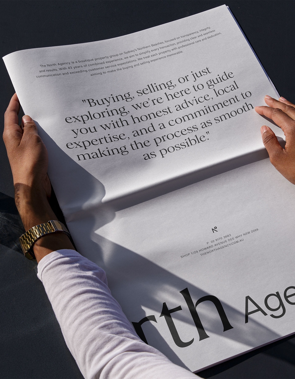
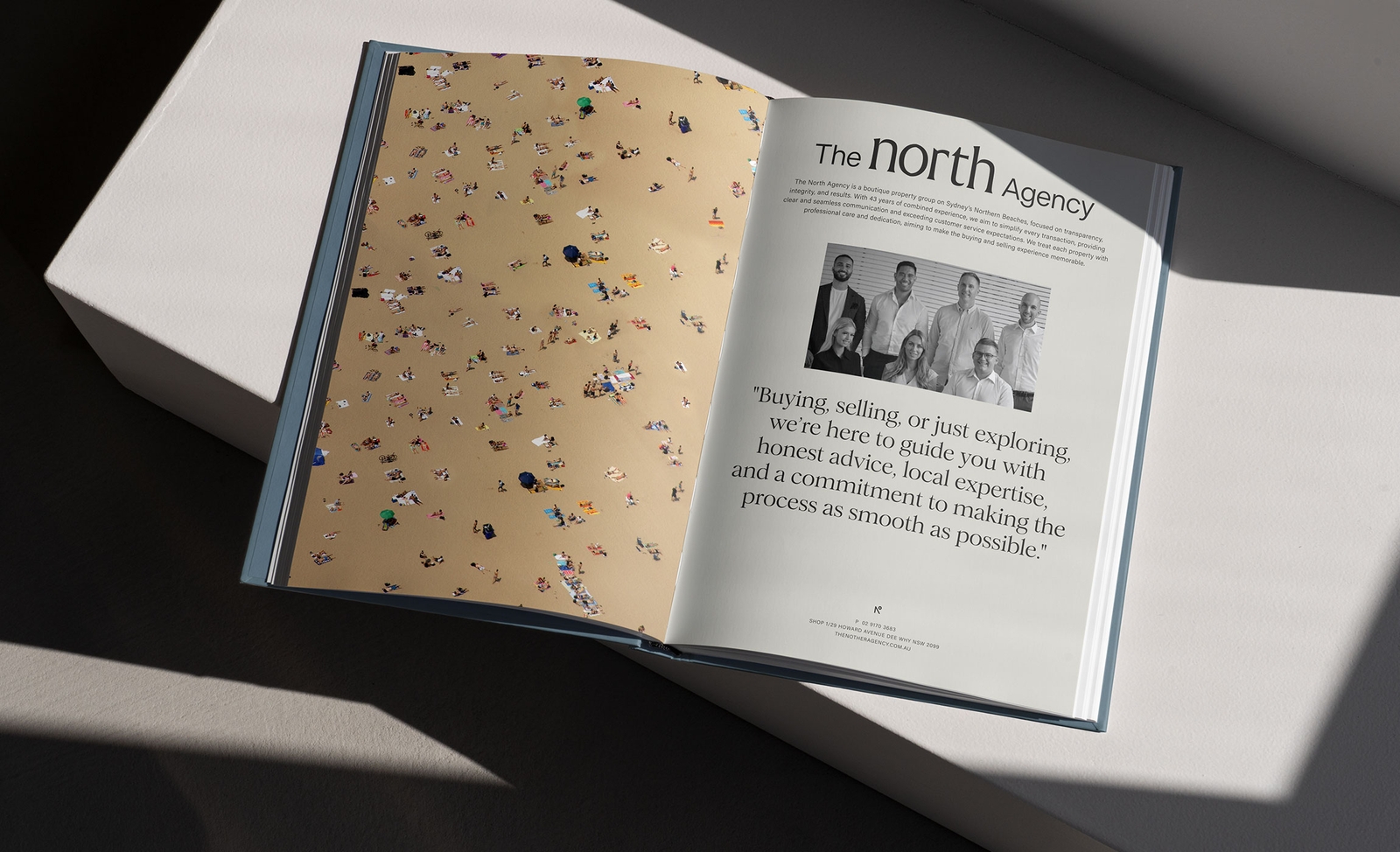
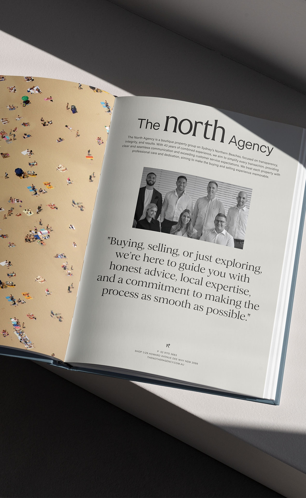
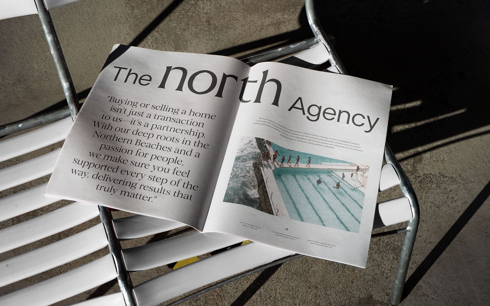
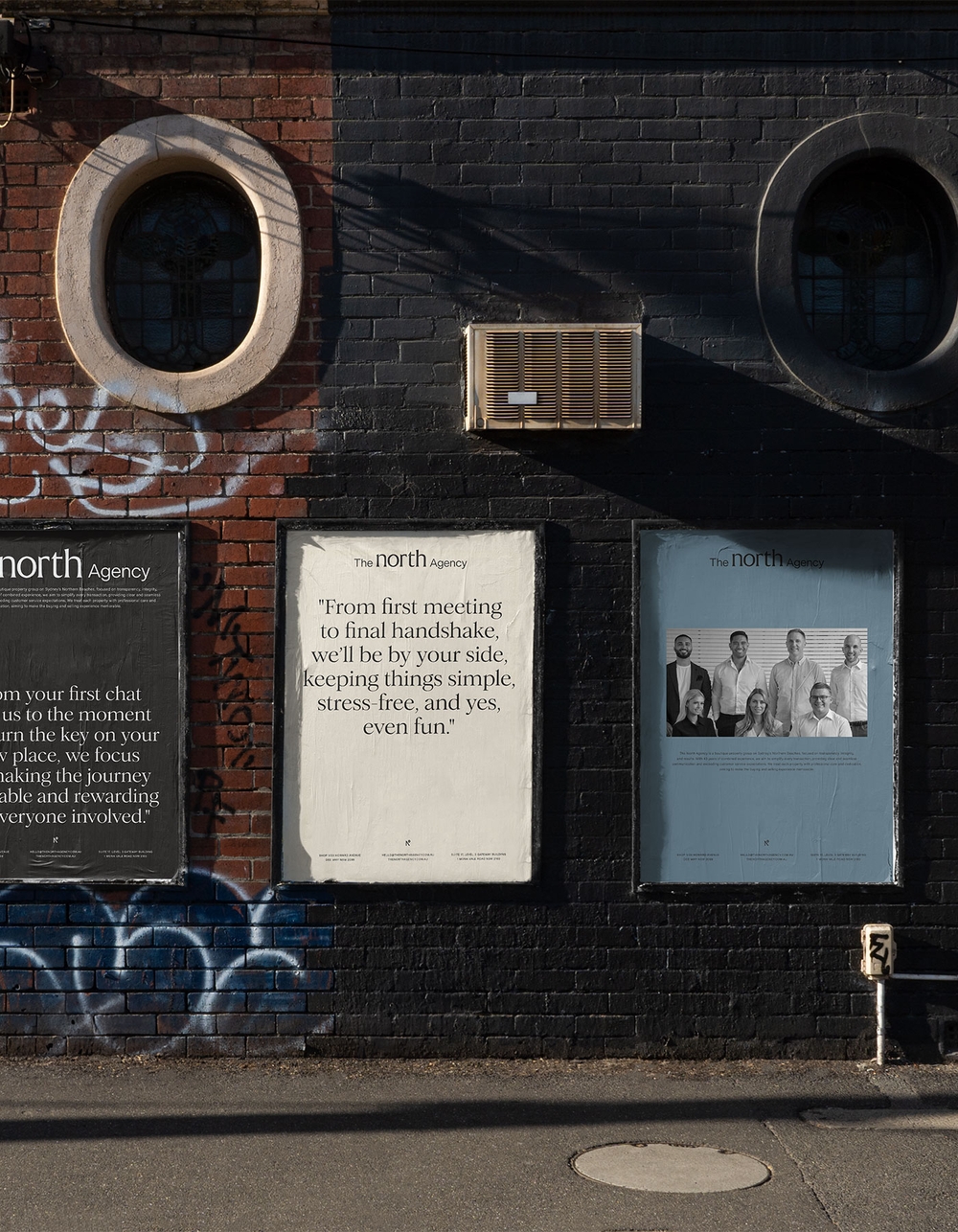
The North Agency came to Atollon with a clear vision: to elevate their brand while staying true to their roots as a down-to-earth, community-focused real estate agency. They wanted an identity that not only reflected their values but also communicated their distinctiveness in a competitive market. We developed a new brand direction centred around their most powerful asset—their people. Through workshops and collaboration, we crafted an identity that’s both personable and professional, leaning into large, impactful statements to highlight their conversational tone of voice. The result? A brand that is approachable, bold, and undeniably local.
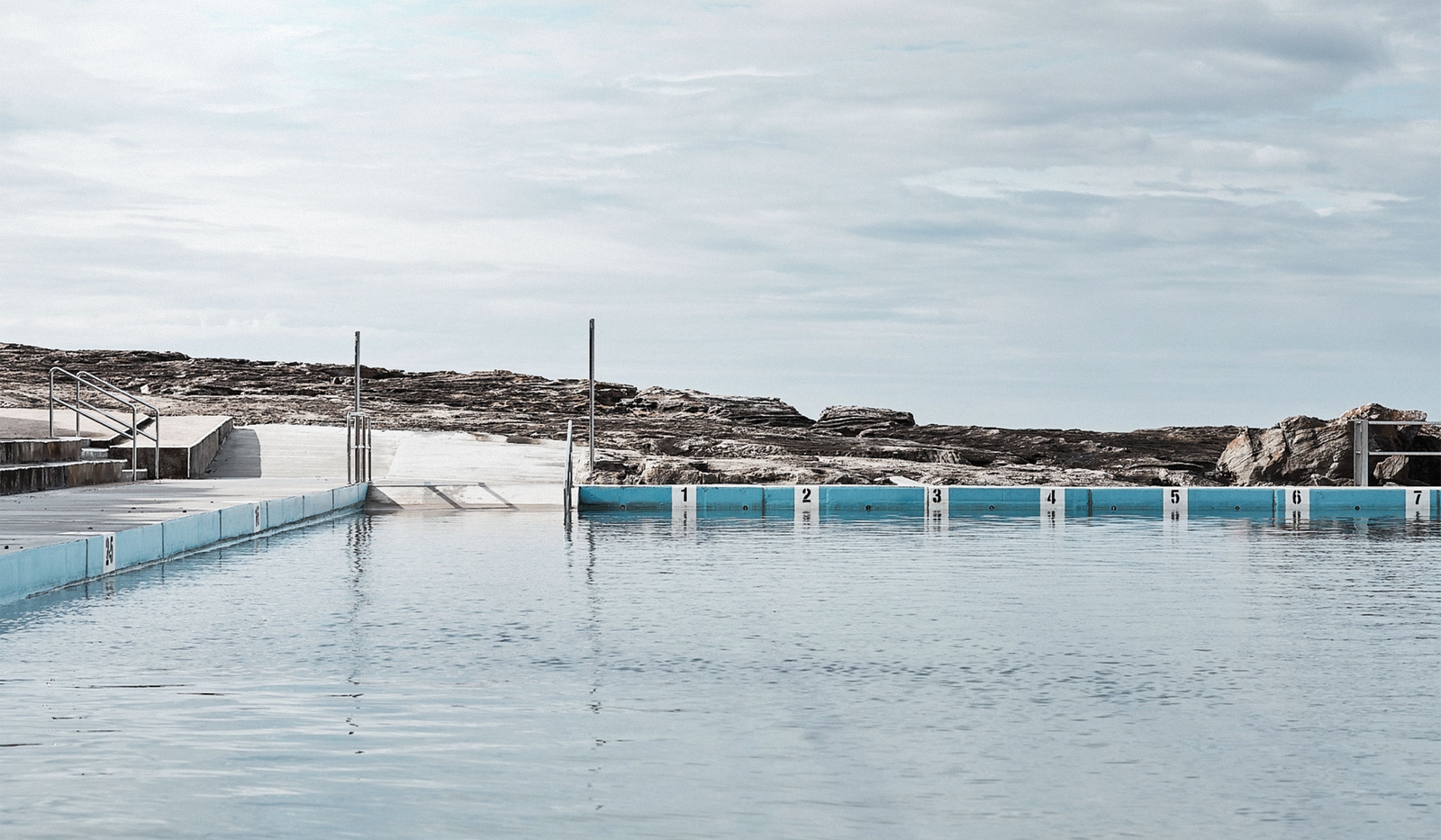
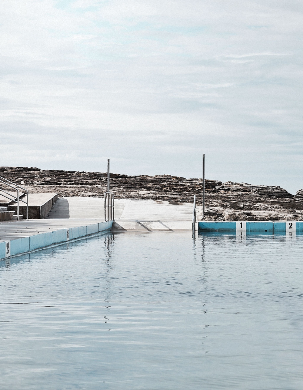
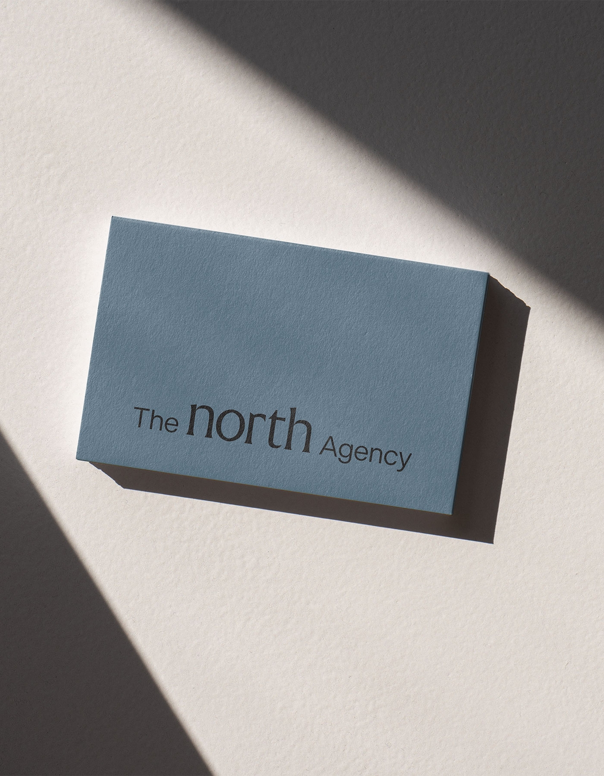
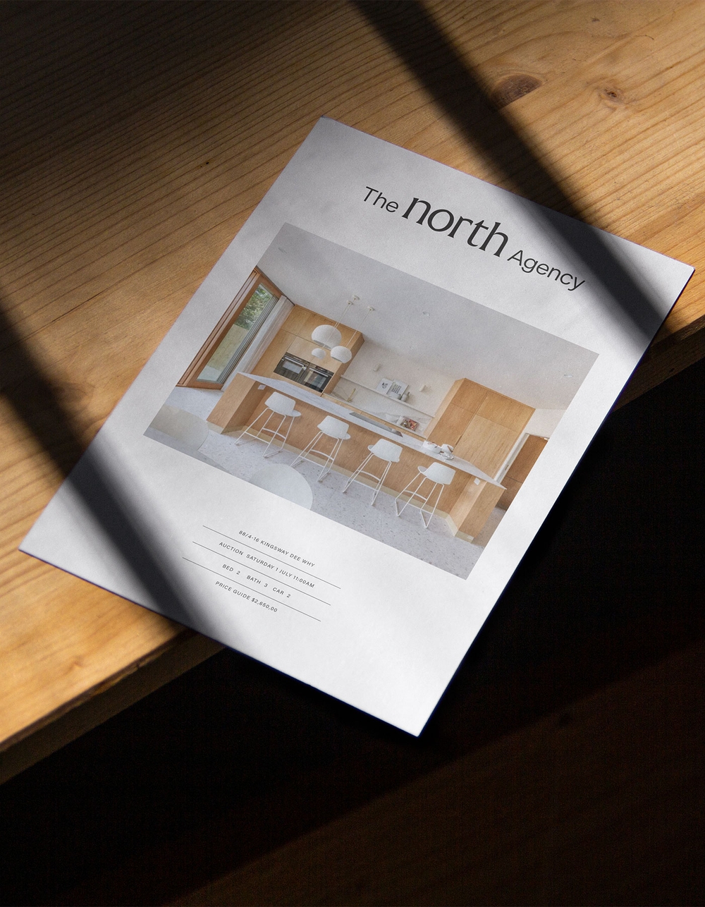
Our work included a refreshed logo, a new colour palette, and comprehensive brand guidelines to ensure consistency across all touchpoints. We designed and implemented a full suite of property marketing tools for print and digital, including signage, social templates, and a website that seamlessly integrates their local expertise. The visual identity is enriched by bespoke photography and video—capturing their agents, properties, and the Northern Beaches community in an authentic and relatable way. This brand is about connection. From the smallest stationery piece to the largest billboard, every element is designed to start conversations, foster trust, and emphasise what makes The North Agency unique.
0

