


Frozen, freshly reimagined.


SunnySide began as a relaunch of SIMPED, a frozen fruit and vegetable brand brought into the Edlyn Foods portfolio. The task was not to lightly refresh what existed, but to create a new brand with the clarity, energy and premium presence the products deserved. Built around vivid colour systems, close-crop ingredient photography and a more contemporary foodservice voice, SunnySide reframes frozen produce as vibrant, versatile and full of possibility.


Frozen, but full of life.
When Edlyn Foods brought SIMPED into its stable of brands, there was a clear opportunity to rethink more than the name. The products were already respected within foodservice. The brand around them simply had not kept pace. The frozen wholesaler category is often practical, functional and visually flat. Packaging tends to feel dated. Communication can be dry. And while frozen fruit, vegetables, pulps and coulis are used by some of the most creative people in food, the category rarely reflects that energy. SunnySide needed to shift the perception. Not supermarket. Not commodity. Not just another box in a cool room.
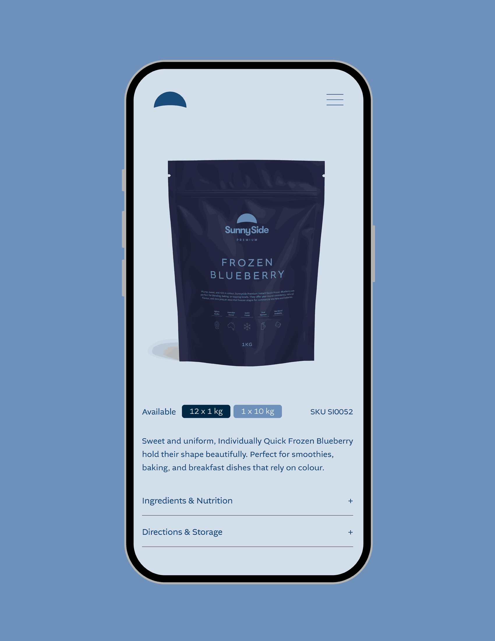
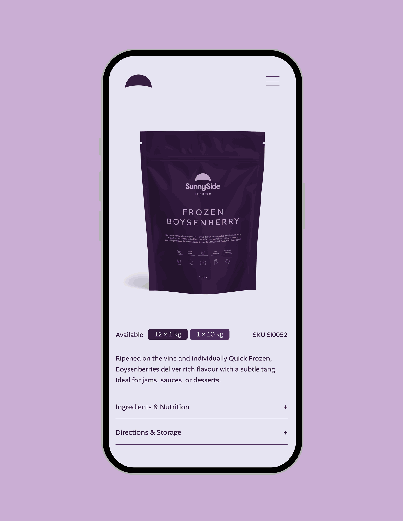
Our role was to reposition SIMPED as SunnySide Premium, building on an established Edlyn product line while giving it a more ownable, modern and expressive identity. The strategic direction was shaped around a simple idea: frozen should still feel fresh. The audience was broad, but specialised. Chefs. Caterers. Pastry teams. Smoothie bars. Commercial kitchens. Beverage producers. Yoghurt and ice cream manufacturers. Foodservice professionals who need consistency, quality and availability, but still care deeply about flavour, colour and presentation. SunnySide had to work hard across all of them. Clear enough for procurement. Inspiring enough for kitchens.
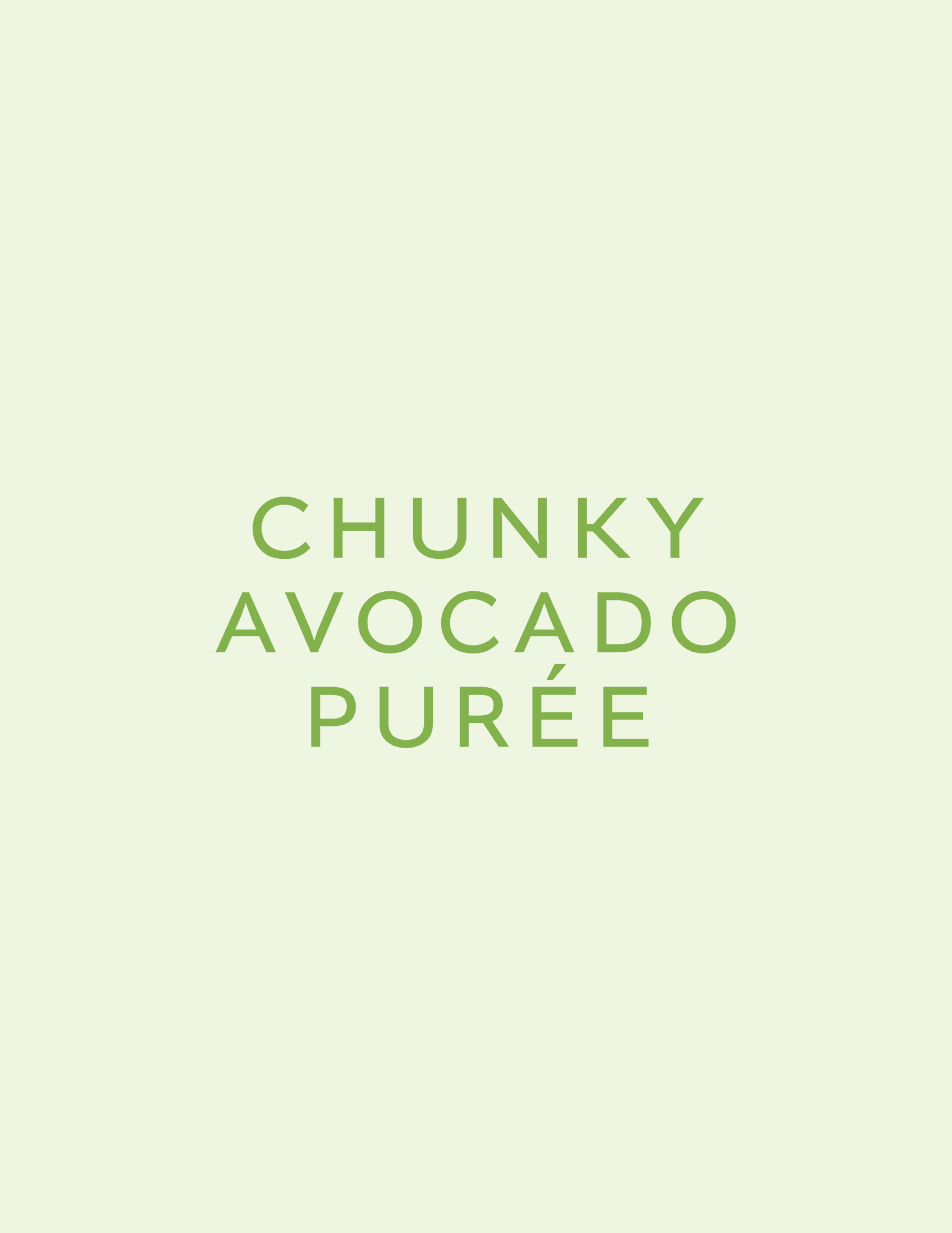
Visually, the brand took cues from health food, contemporary grocery, premium produce and luxury food packaging. The goal was to elevate frozen ingredients without pretending they were something else. Tight, textural food photography became a major part of the system. Mango pulp, berries, vegetables and herbs were treated with detail and drama. Cropped close, rich in texture, full of colour. A reminder that frozen can still be beautiful. Colour became the core brand language. Each product was assigned its own considered palette, drawn directly from the ingredient itself. A light, mid and dark tone created a flexible colour system that could carry across packaging, website, marketing and campaign assets. The result is a full spectrum of food, organised with precision but still bursting with life. It gives every product its own personality while keeping the range connected.
To hold that spectrum together, the brand also needed a strong identity base. We developed two core colours: Abundance, a deep grounding shade, and Ripe, a bright energetic counterpart. Together, they give SunnySide a recognisable brand world beyond the individual product colours. Fresh, minimal, bold and premium, without losing the warmth and approachability of foodservice. The final identity brings a new level of clarity and appetite appeal to the category. It feels clean, colourful and confident. It gives Edlyn a stronger platform within frozen produce, while allowing SunnySide to stand distinctly on its own. A practical product range, given a more vivid point of view. Frozen, but full of life.
0

